Google wants your website to be responsive - and so do we.
We decided in the beginning of 2014 that whether people asked or not we would make a point of making all the sites we made into responsive ones. More and more people are looking at websites on their mobile devices, and having a site that displays clearly, with legible text and images, formatted well within that, is definitely the way forward.
Currently we are working on revised websites for 4 existing clients where we did their website before, and we are creating newly designed ones to update the design and make it responsive at the same time.
What does “responsive” mean?
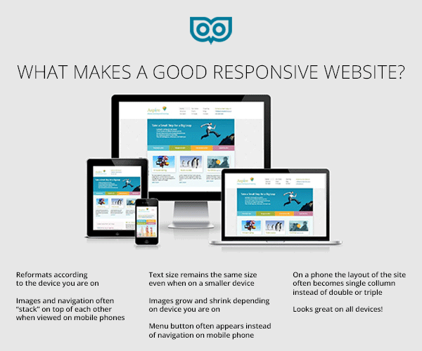
Responsive sites – also called “responsive web design” and “responsive fluid layout” means that depending on the device you are on, the website you are looking at looks different. Not ultra tiny, but actually a different layout – to fit into the dimensions and proportions of that device – whether it’s a mobile phone, ipad or browser. We included this as a must-have for websites in out special report – which you can download by clicking on these words: 6 things every website needs to be, do and have
And recently, Tom Andrews, our SEO partner, emailed us a said:
Google have started sending emails via Webmaster tools to websites which are not yet responsive.
It is anticipated at some stage in the future, once Google feel they have given sufficient time for websites to re develop as responsive, that Google will give preference in the search results on smartphones, to responsive websites.
The emails look like so:
—–
To: Webmaster
Subject: Fix mobile usability issues found on your site:
Google systems have tested 78 pages from your site and found that 100% of them have critical mobile usability errors. The errors on these 78 pages severely affect how mobile users are able to experience your website. These pages will not be seen as mobile-friendly by Google Search, and will therefore be displayed and ranked appropriately for smartphone users.
———
So this means that the responsive thing is going to be for more than just aesthetics and usability – but will be significant in affecting search results, too!
The key characteristics of a good responsive site are:
- Reformats according to the device you are on
- Images and navigation often “stack” on top of each other when viewed on mobile phones
- Text size remains the same size even when on a smaller device
- Images grow and shrink depending on device you are on
- Menu button often appears instead of navigation on mobile phone
- On a phone the layout of the site often becomes single column instead of double or triple
- Looks great on all devices!
If you have any questions about what it would take to make your site responsive, we are happy to provide a free consultation.
How can I tell if my site is responsive?
Usually, we minimise the width of the browser to mimic the width of a mobile phone. There is also a free tool from Google to test if your website is mobile friendly:


Comments
Dawn
Thanks for this. I used the Google test for my new website and it passed! Just got to tidy up the content now…