
How to plan navigation links for your website
We’ve worked on hundreds of websites.
I want to say thousands but when I started Top Left Design 21 years ago I didn’t think to count. Within our accounting software, there are 746 customers in there and that has only been within the last 10 years.
Regardless of this, creating easy-to-navigate websites is something we are really good at. One-click away is our preference!
And it’s not just us, we’ve seen it in how people browse through websites. Humans are used to looking for things in certain places.
What not to do
If you want to know what NOT to do, there are certain mistakes people make with their website navigation, which I see often. They annoy me, but I will not let it ruin my day! Instead, I’ll list them below, and you can quietly check if you’re one of the culprits!
👉 Top navigation links should be only to pages within the website. If you suddenly leave or download a PDF then it’s not what people expect and can be confusing.
👉 Contact link should always be visible, not hidden in About
👉 The Team area could be in the About section, but I prefer it to be a main link – “Meet the Team” or “Who We Are” – this is the part of the website people love to click on because they want to see who works at your business!
👉 It’s very common for people to put way too many links in their top navigation. No more than seven, trust me! Any more, I can spot it right away – it’s too much. And while hard to consolidate in some cases but we’ve managed with all the websites we do, so if you want tips on your particular struggles, share with me your website address and I am happy to help!
Below is a set of rules we follow for the websites we create for our clients:
Start with Home

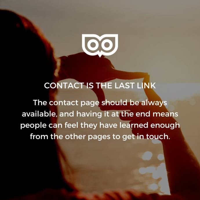
Contact is the last link
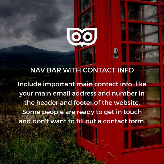
Nav bar with contact info
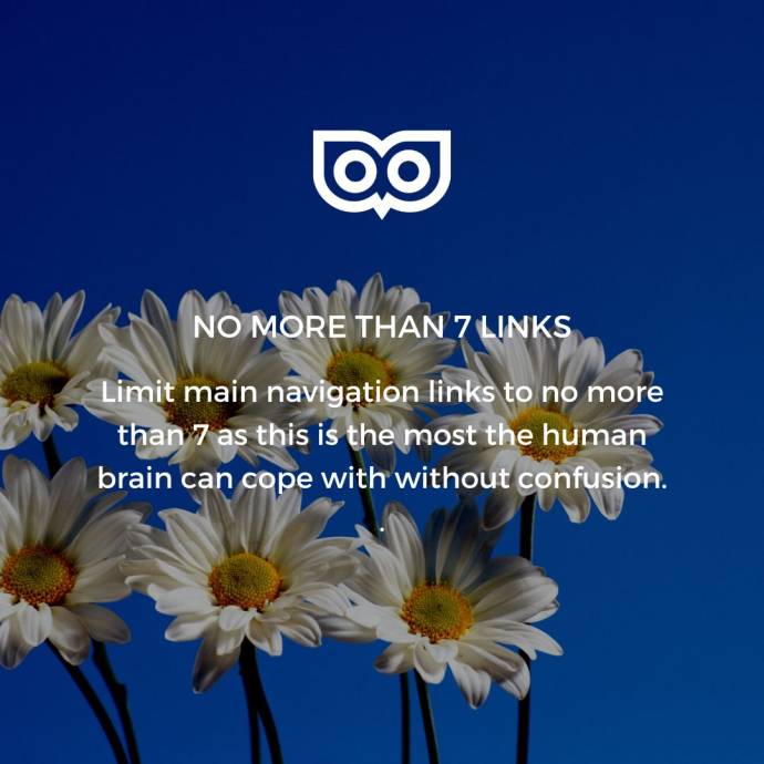
No more than 7 links
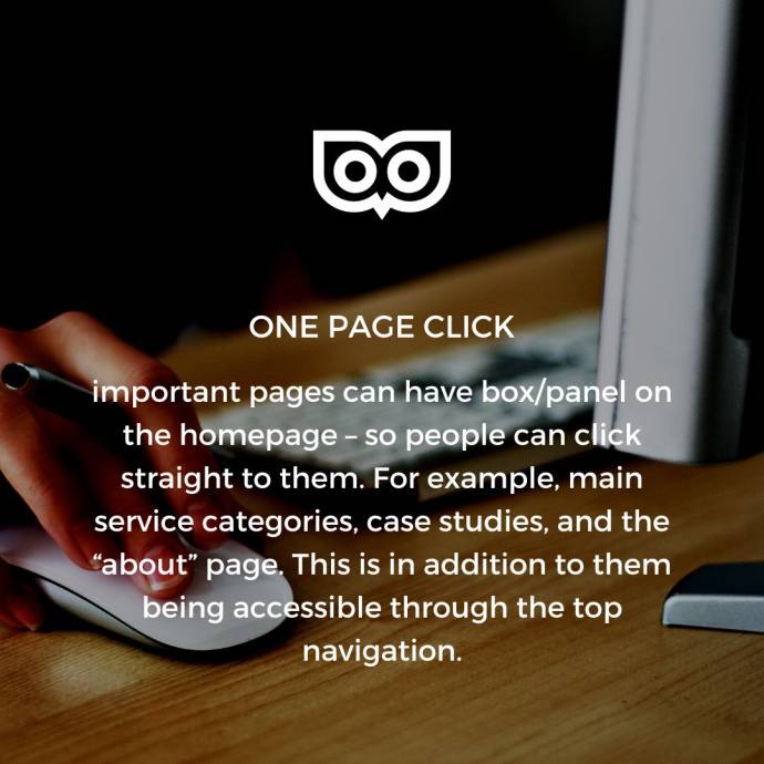
One page click away
A blog link

Conclusion