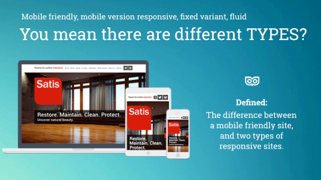
The difference between a mobile friendly site, and two types of responsive sites.
With Google working on changing their search algorithm it’s now widely known that your website needs to be “mobile friendly”. But did you know there are different types and definitions?
Mobile friendly websites
Any website that appears differently formatted to sit the device you are looking at a website on, so you have a good user experience.
Mobile version:
This can be a copy of the website where perhaps you have fewer pages, and those pages are built to format properly on the mobile phone. This means when you look at a site on the phone it looks different, and reformats itself to have the same sized text as the browser version – so, equally legible – and no need to zoom. In addition, images will be sized to fit to the width of the mobile phone, and the design will usually be a single column design so you can scroll down with your finger and read things underneath each other.
Responsive design
Responsive means that you have one website, and the website is specially designed and coded so that depending on the device you view it on, the site looks different. The content reformats to suit the device (tablet or mobile phone or browser) that he user is looking at the website on.
The benefits of this, versus a separate mobile version of the site:
- One set of code for the site
- Google only has one site to index
- There is only on site to keep up to date
- A seamless user experience – if the site is built well
There is now a subdivision! I asked our HTML guru Tom to explain the difference.
Fluid Responsive Websites
If you open for instance www.lewiscraig.co.uk and slowly decrease your browser window’s width, you will see that the site is adapting no matter what screen width it is. This is fluid layout. To achieve this the site has to be properly coded from the ground up. It’s like a transformer. The idea is to keep all the elements the right distances apart from each other, so that whatever you are looking at the site on, it looks clear, legible, and well designed.
Fixed Variant Responsive Websites
On this site, Aspire Leadership the site has 3 fixed variants – for tablet and mobile. This isn’t fluid. Again, resize your window’s width and you will see what I mean. These sites are basically for you to be able to see the right version for that particular device. As long as you aren’t like me – constantly minimising and resizing your browser when looking at every site, then you will see the right version.
How to check which one your site has
Below, an image via Reddit.com – shows the activity we do to check if a site is fluid responsive or fixed variant responsive.

Does that help? Are you confused? Does it all make sense, finally?
Let me know, and if I can make it clearer I will for sure!
See also these other posts:
- What you should know if you are panicking about Google’s Changes
- Google wants your website to be responsive – and so do we.
Get in touch: Email us at team [at] topleftdesign.com and we can discuss how we can reduce your panic further!


Comments
dottdesignsuk
Thanks for sharing such a great post regarding Responsive Web Design.