11 things I've learnt at Top Left Design so far
Get yourself out there!
Now a full time member of the TLD team, I first came to Top Left Design as an intern for two weeks when I was just 14 years old. I’ve spent a lot of time with the team helping out for the past four years and have learnt countless amounts of new and interesting things, and still have much more to learn!
Here are my top 11 so far (in no particular order):
Networking, blogging and social media are the way forward! At Top Left Design Keren and the team frequently update followers and clients with the latest events, offers and daily office going-ons.
Through this constant contact with people, TLD are continually establishing new contacts, friendships and exciting new ventures.
If you get yourself out there and approach marketing with confidence it will reflect on your business and also your own personal confidence – don’t be afraid to be the boldest of the bunch!
Shortcuts
Designing can be a very long process – unless your equipped with the magic shortcuts!
I’ve learnt a countless amount of shortcuts whilst working at TLD for a range of programmes, shortcuts don’t only save you time but also give your mouse a well earned rest.
*Please note we never take shortcuts when thinking up the brilliant ideas behind your designs, and also recommend to never take shortcuts in life!
Design is where the heart is
One of the best things about working at Top Left Design is being surrounded by a team that are passionate about design! Without this passion and drive we wouldn’t be able to produce the beautiful, professional and unique designs which we’re known for.
Size does matter
When designing it’s always important to have a balanced hierarchy of text and images. We always make sure that all elements work in harmony with one another creating a well balanced design.
The size of text, and fonts are fundamental in establishing headings, subheadings, and body text. The key is to use font styles, colours and perhaps two different fonts consistently to represent each section of text, it’s also always important to make sure the text is legible and balances well with images.
A good eye for balance whilst designing really does make a difference – so you see, size really does matter!
Attention to detail
Good design requires a meticulous eye for detail. Its no use creating a beautiful design with those awful mistakes which make your head feel like its going to pop!
When designing we always check that the line height of text, and alignment of different elements is consistent, it’s also important to allow your design to breath. And of course we always look out for those dreaded spelling mistakes, missed full stops and bad grammar!
The importance of presentation

At Top Left Design we’re always presenting new ideas and designs to clients so its important that these designs are presented clearly and professionally.
Creating storyboards is one way which we present website designs. Live storyboards allow clients to view their designs in a browser, they can then compare each design and are also able to see what their site could look like live.
It’s also a handy way for them to get feedback from a friend or colleague, they can simply forward the link for a second opinion.
How to communicate with clients
Communication is key in any business and here at Top Left Design we make sure we’re always able to communicate clearly with clients through emails, phone calls, and meetings.
I’ve learnt how to structure emails which effectively communicate to clients any changes that have been made to their designs, quote for design work and have also learnt how and when to include polite suggestions for further changes/work – its always nice for clients to have input from the designer to help them along the way with the development of their design project. Phone calls – of course I mastered on the first day! (the traditional – Hello Nichaela speaking, how can I help-pen-paper-message) although the in-depth discussion and meetings are still yet to come…
When approaching a new design project it’s essential for both the designer and client to feel comfortable in developing the forthcoming designs. Its important for us to know the style of design the client desires, so we can feel confident in delivering the designs and making changes. Good communication is what makes your design perfect.
How to spot a good image
When including images on websites, in blogs, newsletters etc. its always important that you choose images which are eye catching, attractive and don’t look ‘clip arty’.
Below are three different types of photography, and two tips which will never fail you – what to look out for when your sourcing images :
Bokeh Photography
Bokeh is an adaptation from a Japanese word meaning blur. Photographers create this effect using lenses to adjust focus in the foreground or background, essentially highlighting one object and blurring and expanding areas of light. Just type Bokeh photography into your search engine and see what comes up – the images are amazing!


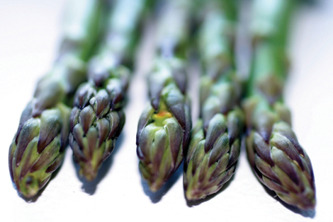
Macro Photography
This close up style of photography is always good if you want to show attention to detail. For example if your a restaurant or food company this type of photography will effectively show off your delicious food, or if your a florist it will highlight the beautiful detail of your flowers in a very sophisticated way.
Tilt Shift Photography
Tilt Shift photographers cleverly create ‘toy like’ scenes using a special lens and movement of their camera. This type of photography creates an interesting and dynamic picture, turning your everyday scene into a miniature world.
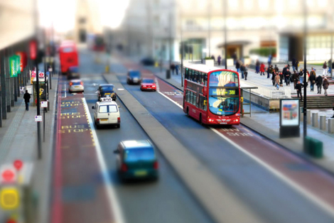
Image source: www.smashingmagazine.com

Image source: www.hongkiat.com
Photography with interesting perspectives, arrangements and use of focus
Images with objects or people just plonked in the center aren’t very interesting and don’t draw in peoples attention. An interesting perspective, and arrangement of objects or people and use of focus will always catch someones eye.

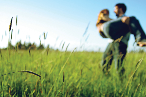
Photography with ‘good’ backgrounds
Try to avoid images with white backgrounds as these can look very clip arty – unless of course you need an image with a white background. A nice scenery or textured background is always a great choice.

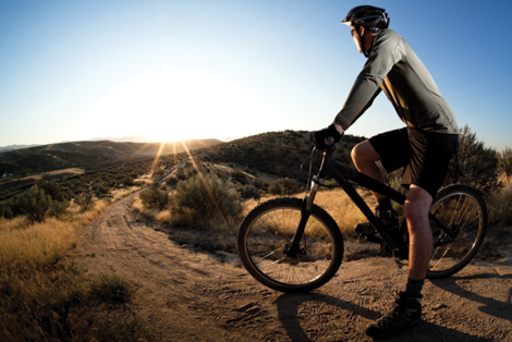
*remember its always good to think outside the box when choosing images, make sure they’re interesting, but also relevant to the message you’re trying to convey.
How to mask!
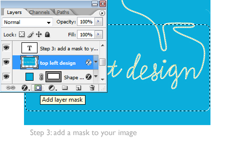
For all you non Photoshoppers out there masking is a very handy tool which can be used in Photoshop, and other Adobe software which I recently found out exactly how to use it!
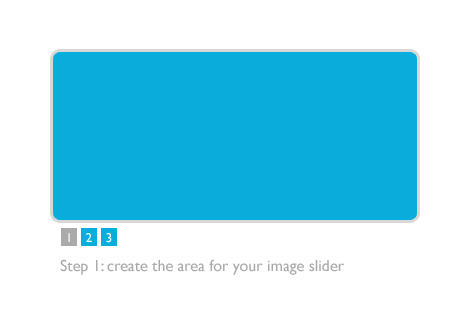
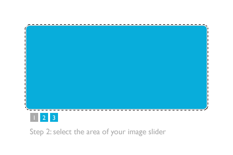
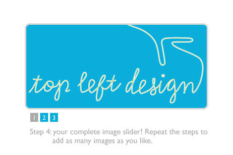
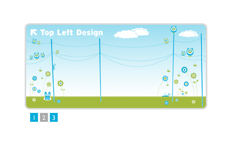
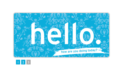
A mask can be made of one object e.g. a box for an image slider on a website. This mask can then be applied to another object such as an image, this will effectively make the image fit within the exact same space as the box – very handy in maintaining a precise and consistent design! See my example below:
Finished! or am I…
Its important not to get ahead of yourself. At Top Left Design we always encourage clients to let us know of any changes they want to their design work. We do whatever we can to create a design which reflects what they envisioned and recognise the jobs only finished when the clients are happy with their final product.
And last but not least… How to make a good cup of tea (I think)
One of the very first things Keren taught me! I’m petrified of making tea for people in case they don’t like it, but no complaints so far! Looks like Keren’s magic paid off.


Comments
Michael
Great blog post Nichaela! All the tips are fantastic, and LOVE the images!
Nichaela Thompson
Thanks Michael! Happy to spread the knowledge 🙂
Alyssa Aldersley
Great post Nichaela. Fab tips on image selection and Photoshop masks. Can’t help but LOVE the superhero boy too!
Nichaela Thompson
Thanks Alyssa, I must say I spent a lot of time finding the perfect images so I’m glad you love the superhero boy! Nice to see you found my tips useful too.
Love the customised superhero boy on your site – Brill!
Alyssa Aldersley
Thanks Nichaela. Customising only takes a little tweak in Photoshop and I just love keeping things on brand. Glad you’re enjoying life at TLD Towers.
Ros Astaire
What a lovely article – you have obviously learned loads with Keren and her team!
Thanks for the info,
Ros
Nichaela Thompson
Thank you Ros.
I have learnt so much already and I’m still soaking up new things every day!
Natalie Smith
Great post Nichaela and I love your examples of photography, but my favourite part is the importance of learning how to make a good cup of tea – that was my starting point in agency life too!
Nichaela Thompson
Thanks Natalie.
Its always important to know how to make a good cuppa!
Felicity Lerouge
Hi Nichaela,
Thanks for this blog. There is so much useful and interesting content in it it’s almost a mini workshop. What you have really made me think about is the important of paying attention to detail, being unique in the way you present yourself and your business and the necessity of getting out there and engaging with your clients and potential market. I always appreciate being encouraged to raise my game.