
Websites for UK Financial Advisers & Financial Planners
In the last year we have been working on a number of websites for financial planners and financial advisers in the UK, along with our strategic partner the lovely Abbie Tanner from A Business Innovation.
Abbie does the strategy and content planning, as well as the copy writing and value proposition, and we have been designing and building the websites according to the brief and branding that results from this.
Montagu Financial Management
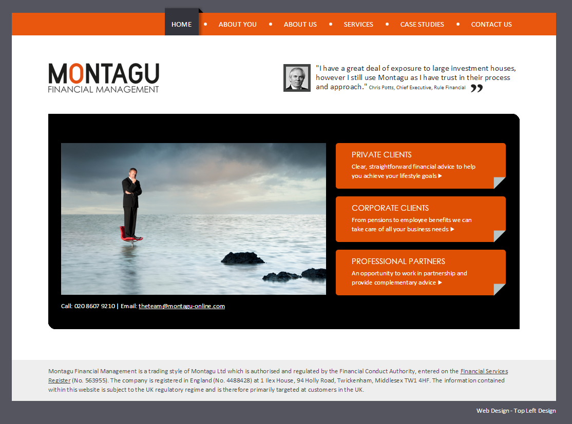
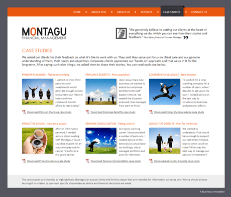
Montagu wanted a crisp, clean website which was easy to navigate – along with the top navigation the site makes great use of internal links which makes moving through the site very simple. The design of the Montagu website came quite easily after we had created their lovely new logo.
They chose to use quirky images and testimonials throughout the site which is a great way to make your company more credible. The website also includes downloadable case studies and links to the team members ContactMonkey contact cards.
Mount Sterling Wealth
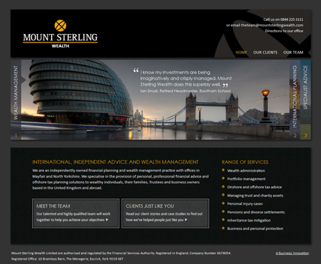
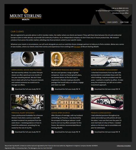 Mount Sterling Wealth are an independently owned financial planning and wealth management practice with offices in Mayfair and North Yorkshire. Mount Sterling Wealth wanted a simple, professional website that ensured that all their information was easily accessible. It’s only a 3 page site but it really packs a punch we think.
The site makes use of a great sliding header which features some of their testimonials, it also has downloadable PDF versions of their case studies and you can find their team members details through the links on the site to ContactMonkey.
Dragonfly Planning
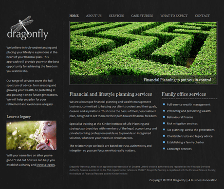
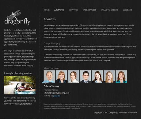
Dragonfly wanted a clean, professional website where they could show off their services and case studies. They also wanted to add interest to their existing logo so we turned the logo into a flash animation with fluttering wings and some sparkles.
This website features rotating images and tag lines on the home page, downloadable case studies, and internal links to make navigating the site simpler. On the About us page we used a really cool roll-over feature for the team members details.
Professional Financial Centre
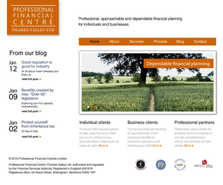
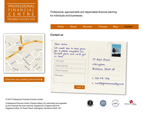
PFC wanted to launch a website that reflected the services and benefits they provide. The brand needed to be strong, classic and clean to help it stand out.
This home page features sliding images and tag lines, the 3 main audiences in 3 separate sections as well as a blog feed of the 3 latest blog posts. You will find their social media links at the top of every page of the site to make it easy for people to connect with them. We also added a nice touch by using aged looking paper to list services and for the testimonials.
Fish Financial
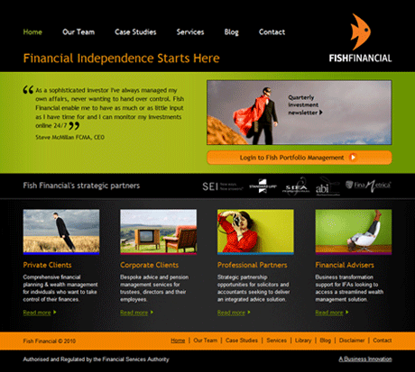
Fish Financial was looking for a fresh, colourful, friendly approachable website which we managed to achieve by using quirky images and bright colours for every page to differentiate between each section of the website.
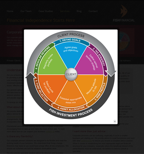
This website features rotating images and testimonials on the home page, downloadable case studies, a resources library with past newsletters and portfolios, a fantastic ‘lightbox’ feature to show their Structured Investment Process along with a blog. The blog, case studies and testimonials are all really great ways to help visitors get to know your company and what you do.
Kubera Wealth
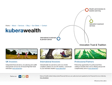
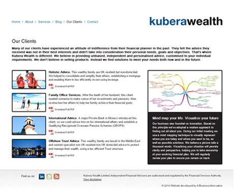
Kubera Wealth was looking for a website redesign that would refresh their online presence and to reflect their corporate image using an uncluttered design that would speak to their clients in a language they would understand.
Top of the list for the client was to create interest right from the get go whilst highlighting Kubera Wealth’s services. We achieved that by creating an animation on the home page. This website also features downloadable case studies, a ‘lightbox’ feature to show their mind mapping technique and a regularly updated blog which also features the clients love of art and photography.
Clarkson Wayman Ball
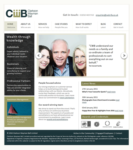
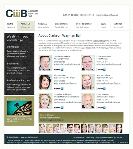
CWB was looking for a website that would demonstrate their commitment to their superior level of service as well as illustrating how they have helped numerous clients with everyday problems just like the rest of us. This was achieved by putting their clients first. The website is obviously a testament to what CWB has and can do but it also allows their clients to tell their own stories throughout the website by way of their case study pages, testimonials throughout the site and scrolling testimonials on the home page.
Their website also features a blog with a feed to the home page which is a good way to make people aware of what’s going on as soon as they arrive at the website. We also used some great functionality on the about us page to feature all team members without needing to use huge amounts of space.
Bluecoat Wealth Management
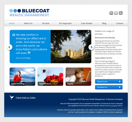
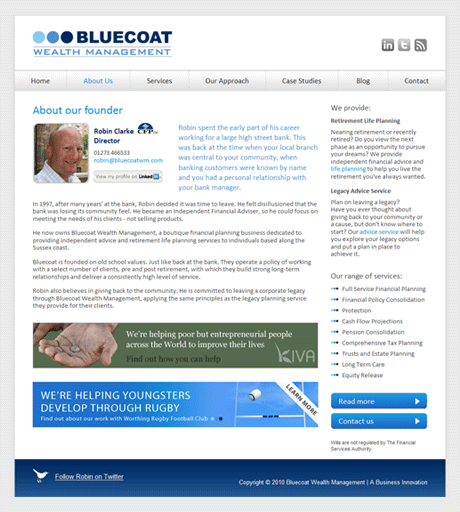
Bluecoat wanted to become known as the leading provider of retirement life planning. We wanted to portray this message whilst keeping the website clean, fresh and easy to navigate. The stock photography on the website also lends itself to retiring, relaxing, taking up a hobby or travelling.
Social media is very important for a company and so we made sure that we had clearly visible links to the social media networks that Bluecoat was on. This website also makes use of downloadable case studies, testimonials and a blog. Robin Clarke from Bluecoat also strongly believes in giving back to community so we have also been working on banners to highlight the good things that Bluecoat does.
Petrus Financial Services
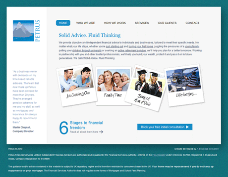
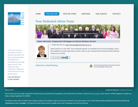
Petrus Financial Services wanted to update their website to have it being fresh, friendly and easy to navigate. They also wanted to have people see the services they offer as you arrive at the website which we achieved using these Polaroid’s which link to the case studies page with downloadable case studies.
Every page also consists of a testimonial which shows off what they have done for their past and existing clients. The real winner of this website is the great functionality used on the who we are page – it works in a similar way to the Facebook tag system where you hover over someone’s face and their name and profile appears. We just love this feature!
PK Partnership
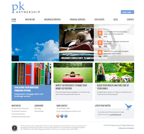
This site is a well thought out site, with the key messages clearly stated on the homepage, and images that consider their audience and messages.
There is a blog on the homepage which PK Partnership work on themselves.
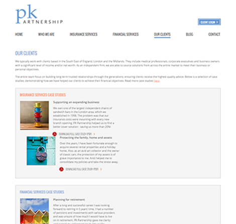
Within the pages there are “hot links” to other areas of the site, and one of the most important sections is the client stories – as when people can understand what makes other clients choose PK Partnership, they understand better who they may benefit.
Maseco Private Wealth


We worked on this project with Abbie Tanner as well. Maseco is a private wealth firm which specializes in American living in the UK – and are able to work in this quite complex tax area.
They use big and meaningful images throughout the site to break up the text, and are clear on what makes them a good choice.
This was a site we took over in the design phase, so we did changes on the designs and created layouts for new pages – and then built it. The site is in WordPress so is updatable easily by the client.


Comments