The evolution of a logo
Your logo is the main element of your branding which you’ll use pretty much everywhere along with your brand colours. Two people who understand the importance of logo design and brand colours are our very own Tamlyn Hall from TLD and colour consultant Karen Haller.
Karen Haller is an Applied Colour Psychology Specialist. She helps business owners to communicate their brand’s authentic business personality in colour, further strengthening their marketing message to increase brand recognition by standing out from the competition and increasing sales.
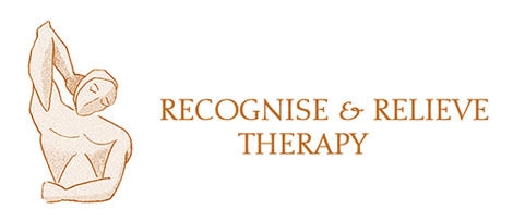
BEFORE: Recognise & Relieve old logo & brand colours
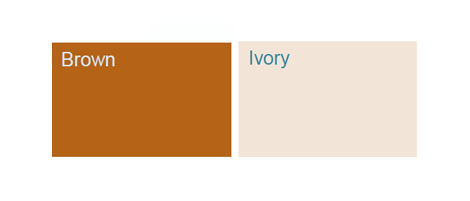
In analysing the old Recognise and Relieve brand colours Karen Haller found that the brown colour palette is from the colour family related to the Autumn season. The monotone variants of brown give an overall subliminal message of safety, seriousness, reliability and support.
Looking at the brand’s core values – aiding positive change, healing and self awareness in a calm and nurturing environment, the old brown monotone colour palette may have, over time, reflected a feeling of heaviness, reluctance for change and seriousness.
Karen felt the colour family which best suits the brand’s core values and aims is Summer. Cool blue based colours with gray added which reflects the cool, calm and elegant sophistication of this brand.
AFTER: Recognise & Relieve new brand colours
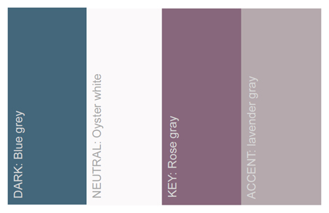
Some keywords related to these colours are honesty, calm, nurturing, reassurance and self healing. Perfect for the Recognise & Relieve brand.
LOGO OPTIONS: Recognise & Relieve logo designs
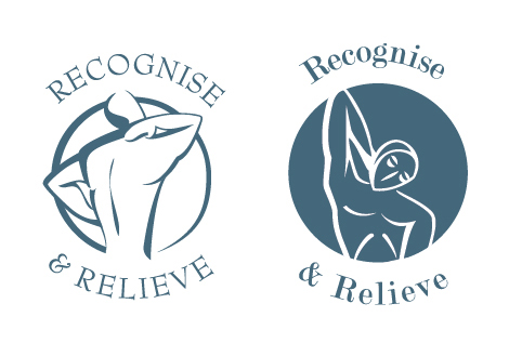
When designing the new Recognise & Relieve logo Tamlyn created three designs considering the brand colours and brand values to reflect the service which Recognise and Relieve provide.
The first and second logo designs reflect an evolution and simplification of the current Recognise and Relieve logo. The idea of using the figure was to reflect the services that R & R provide, the figures needed to symbolise pain and yet relief at the same time. The idea was to use a single flowing line to create the figure, symbolising continuity and strength.
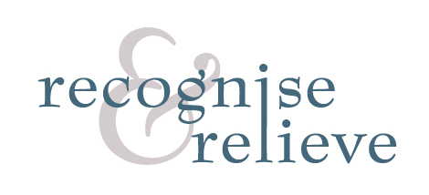
The third logo is a purely typographic logo. Emphasis has been placed on the ampersand, but using a paler colour than the type allows it to not overpower the main typography, whilst joining the “i” and “l” show unity.
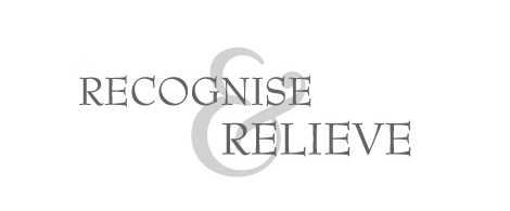
The fourth logo option is more of a mix between a feminine and serious approach. In order to balance the soft feminine curves of the ampersand with an element of seriousness we have used an all caps typeface. The ampersand has again been enlarged to create a unity between the two words.
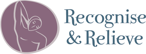
And the final logo?
After several iterations Tamlyn and Marina came up with the following. You can see that the font is now a quirky font to represent Marina’s quirky personality.
So you see logos aren’t just pretty graphics we dream up! When creating a logo design we take our time to explore a range of ideas which translate the values of the company and the service the company provides. Through a clever combination of graphic elements we create unique and meaningful designs every time!


Comments
Stockholm
That’s interesting to see the way a logo is born. However, there is a regrettable machist stain to this article. Why would you need to balance “feminine curves” with “seriousness” ? Saying it that way makes feminine things “unserious”, therefore only “masculine” things are “serious”. Words do matter where feminism is concerned, and that’s a pity a woman wrote that. How right was Sartre when he said “Half victim, half accomplice, like everyone else”.