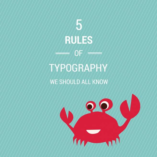
5 rules of typography we should be aware of
Typography surrounds us everyday and most of us aren’t even aware of the impact it makes. We see things written, words grab our attention, we’re swayed into thinking and feeling certain things and we don’t stop to think why.
So maybe it’s time to sit up and take note of these little letters that make such an impact on our every day lives. Here are 5 rules of typography that might make you start to look at things in a different light and realise that no well designed type is ever an accident.
Kerning is key
Kerning is the space that occurs between letters in a word. Most people assume that this is automatically done within editing programs but the truth is that a lot of fonts don’t have great kerning. If the spacing looks wrong to you it probably is. Trust your instincts and fix it by manually adjusting the spacing. It’s time consuming but it can be the difference between a good design and a great design.
You can also force wider kerning to make it work as a design element. It’s not recommended in large bodies to text but for short headlines and buttons a wide kerning can be very effective and completely change the look of a font
The dos and don’t of font communication
There is a certain psychology associated with different font types and we need to be aware of this when designing. Take a look at the message and feelings you are trying to evoke and convey and choose a typeface that reflects that. You wouldn’t use a scripty feminine font to advertise boxing, much in the same way you wouldn’t use comic sans on a wedding invite (unless you’re going for a childlike school theme, then by all means, go for it!)
Don’t be scared to mix fonts (within reason)
Complementary fonts can really highlight and lift each other you don’t have to stick to using just one font in your design, but at the same time, going overboard and using 12 different fonts could be a bit overkill.
Choose a secondary font that compliments but doesn’t overpower the main font. Contrast is good. For example, consider mixing bolder serifed headlines with a lighter sans serif font. There is contrast without the fonts fighting with each other.
Left, left, left right left! The rules of alignment
I’m sure most designers have a few alignment related stories they could share! Alignment is very important part of typography – it can instantly changed the readability of a page depending on what you decide to use.
There are different types of alignment you can use. Left alignment (where all text is aligned to the left of the page / art board) is the most commonly used as it is easier to read – books, newspapers, magazines all use left alignment, or sometimes justified text.
Justified means the text runs from the left margin to the right margin all the way down the page so it looks like a solid text column with no uneven lines on the right side. As no line of words is ever going to be the same length all the way through a paragraph, editing programs will add in or take away spaces in words to create that even column appearance, but this results in eleven spacing and kerning and can start to look a tad messy.
Justified text is okay if use correctly in print design as we have more control over how the text looks and can manually manipulate the words to create better spacing, but it’s a massive no no in web design as you want the text to be fluid and work well on a multitude of devices without breaking. We have little control over how justified text works on a webpage so uneven spacing has a much higher chance of occurring, making for a messy looking webpage.
Centered text is another form of alignment. A lot of people like this because it looks balanced, and it can work really well, but you need to be aware of where you are using it. Small, short paragraphs of text are fine, but it’s not recommended for longer pages of text as it can be hard to read. You need to take into account readability vs aesthetics and decide what is most important.
Lastly be aware of mixing alignments on the same page as it can start looking cluttered and messy.
Size does matter!
Yes yes, I know that we’ve been told otherwise, but when it comes to fonts size can make all the difference. You only have a few seconds to grab someone’s attention so small wishy-washy headlines just aren’t going to cut the cake.
If there is something you want to draw people’s attention to, make it loud, make it bold, play with different font sizes, weights, layout and colours. Anything that is different and bold is more likely to get looked at.
These are just touching briefly on the importance of typography and how much thought goes into a well designed piece of type, but hopefully it’s given you a little insight into the inner workings of a designers mind! So as you go about your everyday life, take note of these letters that indirectly make such an impact, the have a greater power than we give them credit for!

Comments
Alan
Really valuable advice here. Thank you.