The psychology of colour: how to choose your branding colours
A well-thought branding strategy and execution – beyond just logo design – can elevate your business to new levels. It’s been shown over and over, with our clients and others, that spending time and resources on getting this right is a worthwhile effort.
There are many aspects to branding when it comes to graphic design. The choices you make early on will set the entire creative direction for your brand for the long term. One of the most important design choices you’ll make for your business is colour.
What does your business stand for?
Before putting on your creative hat or hiring a graphic designer you need to take a step back. What message do you want to convey to your target audience? The most beautifully designed promotional pieces won’t drive sales if they don’t resonate with your target audience. Making sure your message is on point is crucial to the success of your brand. This is a good time to write or rewrite your mission and vision statements as well as determine your core values. Once you have a clear understanding of your messaging you can then start to make colour choices and set the direction for your brand.
What do these colours mean?
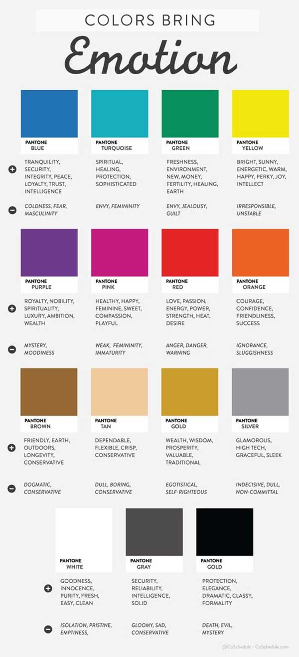
Different colours convey different messages and set different moods. This is a powerful instrument in the toolkit of any marketer and designer. Choosing the right colours for your core demographic can make all the difference when it comes to brand assets like your logo, website and social media accounts. To get you started on the right track here are some of most popular branding colours and their associated meanings:
- Blue: Blue is one of the most popular branding colours, especially in sectors like finance and insurance. This is no surprise given what this colour symbolizes. Blue stands for stability, trust, and confidence.
- Red: This bold colour choice is best for grabbing attention. Red symbolizes passion, power, strength, and determination.
- Green: This colour of course is a great fit for companies operating in sectors like renewable energy, organic food or any nature related product. Green stands for nature, fertility, and growth.
- Yellow: This fun and friendly colour choice symbolizes hope, happiness, joy, and sunshine. Depending on the shade of yellow used this can be tricky to pull of in terms of being legible in print and on the web, however.
- Black: Black is generally associated with formality, power, elegance, wealth, and sophistication. Of course, many high-end products and services want to associate themselves with these characteristics and therefore choose black.
- White: In contrast to black, white is associated with simplicity, purity cleanliness, and reverence. White of course is used against a background colour so that it stands out.
Test different colours before implementing
You can choose the perfect colour based on your company values and colour psychology theory but it might still not resonate with your target audience as intended. Before finalizing your colour choice it’s advisable to run some tests. Use a free logo application like Logo Creator and try out your logo in different colours. With those different branding samples conduct a direct survey with your target audience to find out which colour option they like best. Another graphic design tool you can try for testing is appypie.com, with lots of free layout and design templates. you can try this free tool To scale this effort you can also use a survey tool like Google Surveys. Once you have determined a winner you can finalize your logo in that colour and then build out all of your other brand assets.
Let’s summarise before you get started
Colour has a big impact on how something is perceived. If you can get a leg up on your competitors by putting a thought into the right colour for your logo and overall branding you should do so. Your colour choice shouldn’t just be determined by how pretty it looks but by how it resonates with your core demographic. Make sure you align your colour choice with what your business does and stands for. Best practices also call for some colour tests. Once your colour choice gets a thumbs up from your target audience via direct surveying you can then implement your brand colour with confidence. Happy designing!
A real example:
For example, the pop music festival in London, Mighty Hoopla (who our SEO partner, Tom, works with) makes use of vivid colours to portray the feeling of the music festival, as does the London summer music festival, Brockwell Live, and the free family festival, Brockwell Bounce.