
The hidden pitfalls people face when using brand colours on your site
In an ideal world, your brand colours would be the perfect mix of contrasting hues to grab user attention online and convert browsers into buyers. Unfortunately, many businesses choose their colour palette before they create a website. As a result, what you’ve always used may or may not translate well on the web.
With 32.5 million small businesses in the US, and according to Merchant Savvy, 5.58 million private businesses in the UK (99.9% being SMEs with less than 250 employees). While the number fluctuates monthly, and not all have websites, you’re competing with many other brands for consumer attention.
How can you be true to your brand image while still creating a website that pops? Your colours may be established, but they may not work well online. Here are the hidden pitfalls you might encounter and how to combat them.
1. Not enough contrast
Colours might look fine on print but do not offer enough contrast for screen settings. In addition, you’ll have customers with vision impairments such as colour blindness. Ideally, you’ll layer light and dark colours, so the text is easy to read.
If your colour scheme doesn’t offer enough contrast, you’ll have to see creative ways to keep your colours but make your text readable. Adding solid boxes behind the text, adjusting hues slightly and choosing only one or two colours from your palette are all options.

Big Green Egg naturally uses the colour green in its colour scheme. However, green doesn’t always translate well online, depending on which hue you’ve chosen. In this case, the company decided to focus mainly on a video in the background and use bright colours that stand out.
To work in the green, they placed a box behind the white text. They then added a pop of yellow to draw attention to the call to action (CTA).
2. Lacking emotion
Every colour has an emotion behind it. While people associate different memories with different shades, there are some general rules you can go by. For example, red creates excitement, blue signifies stability and black embodies strength.
The colours you’ve always used may not tap into the emotions driving your users. Think about your buyer personas and their pain points. What sends them to your site for a solution in the first place? How can you add colours to help them tap into those feelings?
3. Too similar to your competitors
Once you begin expanding to the internet, you’ll reach people outside your local community. You’ll also compete with businesses from all over the world. Your colour palette may be unique in your town but very similar to others in your industry.
Some types of businesses choose similar colours. Coffee shops often use green and brown. Restaurants gravitate to red. Check out some of your competitors in surrounding towns. What colours do they use on their sites? Can you mix yours up a bit?

Illuminated Integration creates a unique look for their site by adding some gorgeous purple hues in their hero shot and CTA button. They also use the complementary colour green at the top of their page. It’s not a shade you often see in the industry, so it shows they are trendy and unique.
4. Visually jarring
If you try to utilize too many colours in your design, you may wind up with something unpleasant to the human eye. Try to limit your colour palette to three choices. You can always add in some white or neutrals to balance things out and add more contrast.
Start with a single primary colour from your brand’s look and build around it. You don’t have to use every colour. You can go with just one and then add some you don’t usually use or tap into white and black for text.
5. Clashing colours
Sometimes colours look different digitally than in person. For example, the green and yellow you use for your storefront sign may look great, but using the same shades on your website may not look right.
Designers must develop an eye for colour combinations and make adjustments as needed. Then, take a step back from the screen and see how the hues look together.
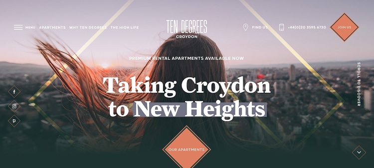
Ten Degrees utilizes orange and yellow. Note the soft look of the yellow. What might initially be an ugly combination becomes much more regal looking. They also add slight transparency to the yellow accents to make them blend with the background.
6. Poor font colours
Choosing font colours is one of the most important things you’ll do for your site. The main goal is to get users to read your content, understand your offer and convert into customers. Therefore, your text should pop against your other colour choices.
You may want to choose a neutral white or black for your font so the text doesn’t fade into the rest of the colour scheme. If you’re unsure about the readability of your site, get feedback from others.
Ask family, friends, and customers to let you know what the first thing they notice is when they land on your page. Also, set up some split testing and try different hues for your headline and body text. Which colours do people respond best to?
Stay true to your image
The colours you use on your site should reflect who you are as a brand. While you want people to recognize you easily, you also have to adapt a bit for readability and impact. Try different shades in the same colour family until you find the combination that speaks to your business’ spirit but also create a strong design for the web.
Eleanor Hecks is editor-in-chief at Designerly. She was the director at a marketing agency before becoming a freelance web designer. Eleanor lives in Philly with her husband and dog, Bear.