Choosing the Right Font: A Practical Guide to Typography Design
When it comes to incorporating text into a design, choosing the right font is as important as choosing the right words.
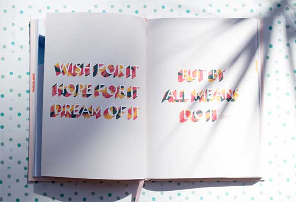
Typography is an ancient craft, and yet one that is constantly changing, with new fonts constantly being designed, and the development of new channels for content delivery. Your font choice should be carefully thought through and determined by a number of factors – and you’ll be surprised to know that ‘looking pretty’ is not top of the list. Ultimately, typography should help your text to achieve its goals. Here are some practical tips.
Readability
What is the most important attribute a text needs to have, regardless of how or where it is published? It needs to be readable, of course. It’s shocking just how many websites, mobile apps, printed materials, even magazines, and newspapers use typefaces and fonts that are ineligible due to character sizing or spacing. Some fonts are simply so ugly or poorly designed that they are almost impossible to read. This also goes for ‘novelty’ fonts – those with a wild and unique style that leaps out at the reader. They may have some ‘wow’ factor, but often don’t stand up to detailed reading, and become a complete turn-off. Don’t fall at the first hurdle – make your text clear and readable!
Know your audience
Knowing who you are catering for and thinking about what would appeal to them is a solid starting point for choosing a font.
Is your audience looking for something classic, a sans serif for example, or something fresh, urban, and contemporary? Your font sets the tone for your text, giving it personality, and by extension breathes life into your brand.
Platforms
We live in an age where content is consumed across a dizzying array of media formats. Print is still a prized commodity, and much content is consumed on desktop or laptop computers. However, smartphones and tablets are now ubiquitous parts of our digital landscape, and much content is geared toward them. The way you choose your fonts and typeface should reflect this diversity – you want your text to be legible and look great no matter how it is consumed.
Size and layout
Eye fatigue is a big thing when it comes to reading texts online. The size and layout of your text can really impact this both negatively and positively, so it’s important to get it right. Everyone struggles with small text, but making characters too big often loses the flow and narrative qualities of the copy. On a desktop website, a line should be between 50 and 75 characters long, with a 16pt (or higher) font. On mobile, it should be 30-40 characters per line, as the tiny screen further magnifies the problem of eye strain.
Color and contrast
Color and contrast are all important when it comes to getting your message across. The early days of web design were marked by garish color combinations which led to (at best) unreadable, and (at worst) hideous and unreadable copy. It is posited that black text on a white background is the most easily readable combination, and although that doesn’t mean every text should be black and white, it means that designers should be well aware of the contrast between their text and its background. An alternative school of thought suggests that black on gray is the best choice, as too much contrast can itself be distracting. Whatever choice you make, the main hiccup you face is the difference between formats. Desktop monitors vary greatly, and mobile users may be outside in bright conditions.
Doubling up
Nowhere does the rulebook state “one font only”. In fact, almost all published texts use at least two fonts to create a dynamic, visual interplay, and to logically separate aspects of the copy. Choosing two fonts that complement each other is a skill all of its own. Fonts shouldn’t fight for attention, they should harmonize together, bring out the best in each other without ever seeming dull or static. It’s worth choosing your primary font, then checking out what It may successfully pair with to bring your text to life.
The main point to remember is legibility. That is the bottom line when it comes to typefaces and fonts. From that clear, readability, with some of these tips, all else will follow.