6 Horrendous Web Design No-Nos
When it comes to making websites look good, there are a plethora of ways to set a design apart from the rest, without needing to delve into the pit of cliché doom.
A strong design does not need gimmicks, just as it does not need uninspired generic content. The tricky part is finding the balance!
Here are some common culprits, steer clear of these or you might end giving people a migrane – or worse – they might steer clear of your site completely…
Full Text Justification
A website is not a newspaper. Even websites owned by newspapers don’t justify their text. Print layout is very different to web layout, and besides the accessibility issues, it just looks messy:

When you justify text on a website, you can end up with large gaps inbetween text, called “rivers”. You see, when a newspaper with justified text is edited, the designer can determine exactly how the text will look as the material will be printed. This means they can remove any “rivers” and compensate for any ugly spacing. However, there is simply no control over this on the internet. People use different browsers, different screen sizes, and can change the font size for accessibility – so fixing a gap for one machine might mean that it looks terrible on another screen. Don’t justify text on the internet.
Splash/Intro Pages
Websites don’t need waiting lobbies! I’m busy, you’re busy – we don’t have time to mess around when it comes to accessing the content you’re after. So why would we want to add an extra hurdle for the visitors of your website to jump over before they can get to the goods?

The 3 click rule states that users should be able to access any part of your site in less than 3 clicks (the clue is in the name) – so why tighten the vice on an already inflexible usability golden rule?
Instead, make sure that your website homepage contains teasers of your most valuable information, acting as a hub to all of your marvellous content.
Flash
Don’t get me wrong, I’m not dissing Flash. Nothing pains me more than to see a product get shunned, when I’ve personally put many, many hours into mastering it. Flash is a very controversial subject in the web design community, and unfortunately, for a good reason.
The mere fact alone that Apple refuses to support Flash on it’s iPhone and iPad devices is reason enough to banish it from your site completely. Your site needs to be accessible to everyone, and in case you hadn’t noticed, those iThingymajigs are rather popular. Build a website in Flash and you suddenly close it off to countless hipsters.

Also, text in Flash websites can’t easily be picked up by search engines, so not only will nobody using an iPhone be able to view your site, they won’t be able to find it, to discover that it doesn’t work.
It’s also bad for accessibility, as it does not support use of the browser’s back button, or resizing of text for users with sight impairment.
Flash is not without it’s uses though – it’s a great tool for presentations, animations, games, advertisements and application development.
Further reading on this controversial subject:
Is Flash dead yet?
5 reasons NOT to use Flash on a website
What is Flash, when and why should you use it?
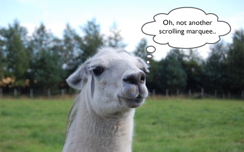
Scrolling Marquees
Oh snap, is it 1999? I’d better start making plans for New Years, I hear the new millennium is going to be off the hook! Wait – It’s just that your website LOOKS like it hasn’t been updated since 1999 because you’ve got a bar of text flying across the screen. I shouldn’t need to explain why this is bad for accessibility, but it’s like clay pigeon shooting with your eyes. Text marquees are the cheekiest text of all – always trying to get away while you’re trying to read it.
NEE NOOR NEE NOOR – Catch me if you can! This text looks unprofessional and belongs back in the nineties with Saved By The Bell – NEE NOOR NEE NOOR
Alternatively, use content sliders, and let the text stay still for a second so people can catch a glance.
“Helpful” Video Assistants
Do you remember the annoying paperclip from Microsoft Word? Well he evolved, became self-aware, and (like the Cylon) developed more advanced paperclips, disguised as human beings.
At least that’s what must have happened, I can’t think why any rationally thinking company would want this on their website:

They are rarely helpful, and always annoying. Especially as the vast majority start speaking immediately and usually it’s salesy gibberish with no real value.
A well thought out FAQ page or help section is much more effective, and much less likely to make someone rush for the back button. The only sites that should autoplay video/sound are YouTube and memes. It’s just bad user experience all around.
“Click Here”

It’s the easy way out, and very, very common across the Internet. But a link saying “click here” is not only unimaginative, but also bad for SEO and users with visual impairment using screen readers. Get your creative juices going, and think of a better way to get your users to that content. The link should be on the name of the product or service, not on the verb of how to get there.
Instead of “Click Here” – use “View the full explanation” or “See some of our latest inventions” and make those the link. Your users will have a much better experience all around.
Are you guilty of any of these website faux pas?
Are there any more you can add to the list?


Comments
Adele
Very good, Michael – especially that ‘enter site’ waiting lobby one. God, that has never made sense to me – if I didn’t want to enter your site why would I be on your page??
Gina Romero
Oh how I laughed and sniggered (especially at the scrolling marquees) but then … OH NO I’m guilty of using Click Here links!
And It’s so obvious now that you’ve pointed it out! Thanks for this amusing but really useful article!
Michael Hobson
Thanks very much Adele & Gina! Glad you enjoyed the article and found it useful!
Aniket Mohite
Good article.
A website should be captivating. But making it splashy doesnt serve the pupose.
Using flash & help videos, increase site loading time which your visitors dont want. Also, splash pages are kind of time waste (until your website is some designer brand like interiors, fashion, photography, etc), but still, people more often like getting to the point. Scrolling marquees, totally bad idea.
Nice post. Basics for any website development.
Nada Photography
Hilarious! I have one more, and it’s more visual than technical – stretched (badly re-sized) photos. It just screams “I don’t care”.
Jan Jasper
Excellent article. This sums up annoying things I’ve noticed in some websites that I could never quite “put my finger on.” You’ve done a great job of identifying these web offenses and explaining why we should avoid them, and what we should do instead. thanks.
– Jan Jasper
factgasm
Here in Indonesia, we designers frequently embed important text in images. This means it can’t be translated to other languages on the fly.
Here’s a classic example:
https://oss.go.id/