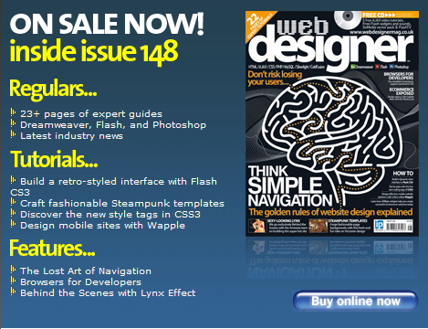
TLD in Web Designer Magazine
Another article has just been published! This magazine is OUT NOW!
Its Q+A style – click below for an excerpt!
How creative can you be with web site navigation?
Creativity has its place, but you need to be clear with the names you use for the navigation links. Some link names should be standard. I know people like to come up with fun link names, but the point of navigation links is to bring people to areas of the site where they would like to find certain information. I recommend always having a link called “Home” to bring people back to the home page and a link called “Contact” at the end of all the other links to bring people to the contact information. You can change some terms; for instance, the “About” page can be called “Who we are” or “Our team” or even “Our philosophy”.
How many navigation links should there be?
That’s always a debating point. I recommend no more than seven links in any link area. You can have navigation links on the op or the left but if you have eight or more it tends to look quite cluttered. I see a lot of content management system sites where the client has been given a site with seven main links, but has the freedom to create more and this makes the site look messy and so it loses credibility. The number of links you have also has an impact on the text size you can use. This is something you have to have a designer’s “eye” for, but all the different navigation systems need to be in balance in order to show the right hierarchy of information. I recommend getting a good design signed off before allowing the HTML to be built.
If we can only have seven navigation links, how do we include all the navigation we need to?
Not all of your navigation needs to be in your main menu; it can be placed elsewhere. Your homepage and other landing pages will allow you to include your main navigation links but you can also include other links on each page to “special areas” of the site you would like people to visit. These might say “Read what clients have to say about us” or “Latest Offers” or “New this week”. Anything you would like to highlight can therefore be designed into the layout no matter what software you use. It is important to consider these things at the outset when planning the site so that your design incorporates them in a clear and effective way.
Are current design trends, such as greater use of Flash, having an impact on navigation?
I think it means designers need to concentrate more on the essential issues. For instance, we have all become very familiar and efficient with using websites and now expect to navigate our way to and interact with them extremely quickly. As a result, we are less patient with those websites that are difficult to use. Also, we have learnt to process information on screen with extreme rapidity, and being impatient to read and assimilate as much as possible in ever shorter periods of time, we instead scan the page and click instantly onto the first item of interest our eyes alight upon. So the navigation really has to work and be highly efficient. Newer software also means we sometimes forget the basics. Using live text for links instead of images is important for two reasons – it helps with search engine ranking, but also makes the site more accessible for visually impaired people who are using screen readers.

Comments
chinaman
Hi
I like your posts, It makes me thinking.